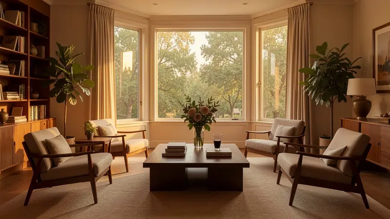
Good visual design is not only about choosing attractive colors or stylish fonts. It is about arranging elements so people know where to look, what matters, and what to do next. Home decor solves many of the same problems by balancing furniture, color, lighting, texture, and empty space within a room. By studying how a well-designed home works, we can find practical lessons for websites, graphics, presentations, and digital content, including how to create a banner that communicates clearly without looking crowded.
What Does Home Decor Have in Common With Visual Design?
Home decor and visual design both organize individual elements into a complete experience. In a living room, a sofa, rug, lamp, wall art, and coffee table may look ordinary on their own. Their placement, scale, colors, and relationships determine whether the room feels comfortable and coherent.
A digital layout works in much the same way. Headlines, images, buttons, icons, text, and backgrounds are individual pieces. Effective visual design gives those pieces a clear relationship. The viewer should understand what deserves attention first and where to look next.
This idea is often described as visual hierarchy. Visual hierarchy is the arrangement of design elements according to their importance. Designers establish it through size, position, color, contrast, typography, and spacing.
A room without hierarchy can feel chaotic because everything competes for attention. A page, ad, or graphic can suffer from the same problem. If the headline, image, button, logo, and supporting copy all demand equal attention, the viewer has no obvious starting point.
Key takeaway: Home decor and graphic design both succeed when individual elements support a clear visual hierarchy instead of competing for attention.
How Does a Focal Point Guide the Viewer?
Most successful rooms have a focal point. It might be a fireplace, a large window, an artwork, or a statement piece of furniture. Other objects support that feature rather than trying to overpower it.
Visual communication needs the same discipline. Every design should have a primary message or action. A landing page might emphasize its headline. A poster could emphasize an event name. A promotional graphic may lead with an offer.
When you create a banner, for example, decide what the viewer should notice within the first few seconds. The main message should usually receive the strongest combination of size, contrast, position, and surrounding space. Secondary details can then appear at a lower visual level.
A useful test is to look at the design from a distance or reduce it to thumbnail size. What do you notice first? If a decorative image or minor piece of text dominates instead of the core message, the hierarchy needs adjustment.
Key takeaway: Choose one primary focal point and let supporting elements guide attention toward it rather than competing with it.
Why Is Balance Important in Effective Visual Design?
A room does not need perfect symmetry to feel balanced. A large sofa on one side, for instance, might be visually balanced by two chairs and a floor lamp on the other. The objects differ, but their overall visual weight feels stable.
Visual balance means distributing the perceived weight of elements across a composition. Size affects visual weight, but so do color, contrast, texture, shape, and position.
Designers generally work with two useful forms of balance. Symmetrical balance places similar visual weight on opposite sides of a layout. It can communicate stability, order, and formality. Asymmetrical balance uses different elements while keeping the overall composition stable. It often feels more dynamic.
Neither approach is automatically better. The right choice depends on the message. A formal report may benefit from a controlled grid, while a creative campaign can use asymmetry to produce movement and energy.
Before adding another element to an empty area, ask whether the space truly needs something. Empty space may be performing an important balancing function.
Key takeaway: Balance is achieved through proportion, not by matching everything exactly. It is about distributing visual weight so the composition feels intentional and stable.
What Can Interior Color Schemes Teach Designers?
Interior designers rarely choose every color independently. They usually build a palette in which colors have specific roles. One may dominate the room, another supports it, and an accent color creates emphasis.
Digital designers can follow the same logic. A limited palette usually creates stronger visual unity than a collection of unrelated colors. It also makes emphasis more meaningful because accent colors remain distinctive.
For example, a simple visual system might use:
- A neutral background as the dominant color
- One primary brand or theme color
- A secondary supporting shade
- An accent color for important actions or information
- High-contrast text for readability
Contrast matters as much as the palette itself. Text must remain readable against its background. The Web Content Accessibility Guidelines from the W3C Web Accessibility Initiative provide established guidance for accessible contrast and other interface considerations.
Color should not carry meaning alone. If an error message is shown in red, for instance, an icon or clear label can provide another cue. This makes the information easier to understand for more users.
Key takeaway: Treat colors as a system with defined roles. Use contrast for clarity and reserve accent colors for elements that genuinely deserve attention.
Why Does White Space Work Like Empty Space in a Room?
A well-decorated home is not one in which every wall, shelf, and corner has been filled. Open areas give important objects room to stand out and make the environment easier to experience.
Graphic design uses the same principle through white space, also called negative space. White space is the unoccupied area around text, images, controls, and other visual elements. White is not the only option.
Spacing separates unrelated content and connects related information. For example, placing a heading close to its related paragraph makes their connection clear and easy to understand. A larger gap before the next section signals that a new idea is beginning.
Crowded designs increase the amount of information a viewer must process at once. Removing unnecessary decorations, reducing competing messages, and increasing spacing can make the main idea easier to identify.
This principle is particularly useful for banners and other compact formats. Limited space does not mean every available pixel should contain something.
Key takeaway: Empty space is an active design tool. Use it to separate ideas, strengthen hierarchy, and give important content room to stand out.
How Can Scale and Proportion Improve a Layout?
An oversized sofa can overwhelm a small room, while a tiny rug can make the same room feel disconnected. Interior decorators pay attention to scale because objects need to fit both the space and one another.
Digital layouts also depend on scale and proportion. A headline should be noticeably different from body text. Icons should suit the controls around them. Images should support the message without overwhelming useful information.
Scale can also communicate importance. A larger element usually attracts attention before a smaller one, which makes size one of the simplest ways to establish hierarchy.
However, constantly making important elements larger creates another problem. When everything becomes big and bold, nothing feels important. Designers need contrast between levels.
Try defining a small set of sizes before building a layout. For example, define consistent styles for main headings, subheadings, body text, captions, and buttons. Reusing those levels produces consistency and makes the design easier to scan.
Key takeaway: Use scale to show relationships and importance. A small, consistent size system creates clearer hierarchy than arbitrary resizing.
What Can Repetition in Home Decor Teach Us About Consistency?
Interior spaces often repeat materials, colors, shapes, or finishes. A wood tone may appear in a table, shelf, and picture frame. A particular color may return in cushions, artwork, and accessories. Repetition connects separate parts of the room.
Visual design benefits from the same approach. Repeated typography, colors, corner styles, spacing patterns, and icon treatments help viewers understand that elements belong to the same system.
Consistency also reduces unnecessary decisions. Once a button style or heading treatment has been established, it can be reused instead of reinvented on every page.
This does not mean everything should look identical. Effective repetition works alongside variation. A designer can maintain the same visual language while changing imagery, content, or emphasis.
For broader digital experiences, the Nielsen Norman Group’s usability research highlights consistency and standards as an important usability principle. Interfaces become easier to understand when they follow familiar patterns that users already recognize.
Key takeaway: Repeat key visual rules to create unity. Consistency helps viewers recognize patterns and understand a design faster.
How Can Layering Add Depth Without Creating Clutter?
Interior designers create depth through layers such as rugs, furniture, lighting, curtains, cushions, artwork, and smaller accessories. The goal is not to add as many objects as possible. Each layer contributes something to the room.
Visual design can use layering through backgrounds, images, typography, shapes, shadows, and overlays. When handled carefully, these elements establish depth and direct attention.
The danger is decoration without purpose. Extra gradients, icons, patterns, shadows, and illustrations can quickly create visual noise.
A simple test can help: remove an element and compare the result. If the message becomes clearer and nothing useful is lost, the element probably was not necessary.
This approach is especially valuable when you create a banner or other design that viewers may see only briefly. Every layer should improve communication, hierarchy, or recognition.
Key takeaway: Add visual layers only when they support meaning, hierarchy, or atmosphere. Decoration should never make the message harder to understand.
Step-by-Step Guide: Apply Home Decor Principles to Your Next Design
You can turn these lessons into a practical design process:
- Define the purpose. Write down the one message or action the viewer should remember.
- Choose the focal point. Decide which element deserves attention first.
- Establish hierarchy. Assign clear visual levels to headlines, supporting text, images, and actions.
- Build a limited palette. Assign a clear role to every color instead of selecting them at random.
- Protect white space. Leave enough room around important elements to make relationships obvious.
- Set consistent scales. Establish repeatable sizes for typography, imagery, and controls.
- Repeat visual patterns. Reuse colors, type styles, shapes, and spacing rules.
- Remove unnecessary decoration. Test whether every visual element contributes to the message.
- Review at realistic size. A banner, mobile interface, or presentation slide should work in the environment where people will actually see it.
This checklist applies to many formats, from social graphics to web pages. For related workflows, an internal resource such as a visual design checklist can give teams a repeatable review process before publication.
Key takeaway: Start with purpose and hierarchy, then use color, balance, spacing, scale, and repetition to support that purpose.
What Should Designers Avoid?
One of the biggest mistakes in home decor is buying attractive objects without considering how they work together. The digital equivalent is choosing fonts, illustrations, colors, and effects individually because each one looks impressive.
A successful composition needs a shared visual logic. Before adding something, ask three questions:
- Does this support the main message?
- Does it fit the existing visual system?
- Does it improve understanding or usability?
If the answer is no, removing the element may strengthen the design.
Designers should also avoid copying trends without considering context. A fashionable interior style may be unsuitable for a historic home, just as a trendy visual effect may conflict with the purpose of an accessible information page. Principles tend to last longer than trends.
Key takeaway: Judge design choices by how well they work together and support the message, not by how impressive they look in isolation.
Frequently Asked Questions
What is the most important lesson home decor teaches about visual design?
The strongest lesson is that individual elements need to work as a system. Color, scale, spacing, balance, and hierarchy should support one clear purpose rather than compete independently.
Takeaway: Effective visual design comes from relationships between elements, not isolated styling choices.
How does visual hierarchy improve a design?
Visual hierarchy tells viewers what to notice first, second, and third. Designers can create it through differences in size, contrast, color, position, typography, and spacing.
Takeaway: Strong hierarchy makes information easier to scan and understand.
Is white space wasted space?
No. White space separates information, creates emphasis, improves organization, and gives the viewer visual breathing room. Filling every available area often makes a composition harder to understand.
Key takeaway: White space is a purposeful design element, not an empty area that needs to be filled.
How many colors should a visual design use?
There is no universal number. A focused palette with clearly defined roles is usually easier to manage than many unrelated colors. Designers should also check contrast and accessibility rather than choosing colors only for appearance.
Takeaway: Use as many colors as the communication requires, but give each color a clear role.
Can home decor principles help with digital banners?
Yes. Focal points, balance, scale, color, repetition, and negative space all apply to banner design. Because banners often have limited viewing time and space, these principles can make the main message easier to recognize quickly.
Takeaway: Treat a banner like a small room where every element needs a purpose and the focal point must be obvious.
Conclusion: What Makes Visual Design Feel Intentional?
Home decor shows that strong design rarely comes from adding more. It comes from making thoughtful relationships between the elements already present. A successful room uses focal points, balance, proportion, color, repetition, and open space to create an experience that feels coherent.
The same principles apply to digital visual communication. Establish the main message first, create a hierarchy around it, and remove anything that competes without adding value. Whether you are working on a website, presentation, social graphic, or banner, the goal remains consistent: help people understand the message with as little friction as possible.
Key takeaway: Effective visual design combines clear hierarchy, purposeful color, balanced composition, consistent patterns, appropriate scale, and generous spacing. Home decor makes these principles easy to see because both disciplines turn separate elements into one coherent experience.